Design Systems · Foundations
Systems that make teams faster, not slower.
Tokens, components, and documentation that engineers actually want to use — because they're built with them, not for them.
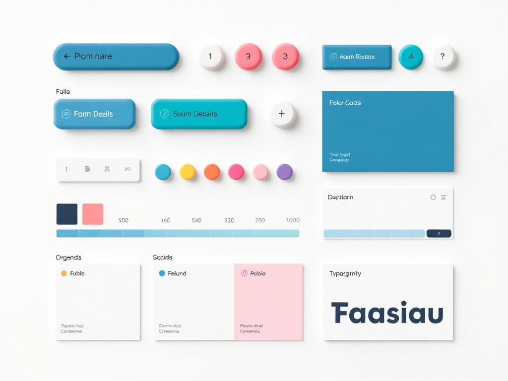
A closer look at the work.
Each project below is a slice of the same practice — design that's clear, warm, and useful.
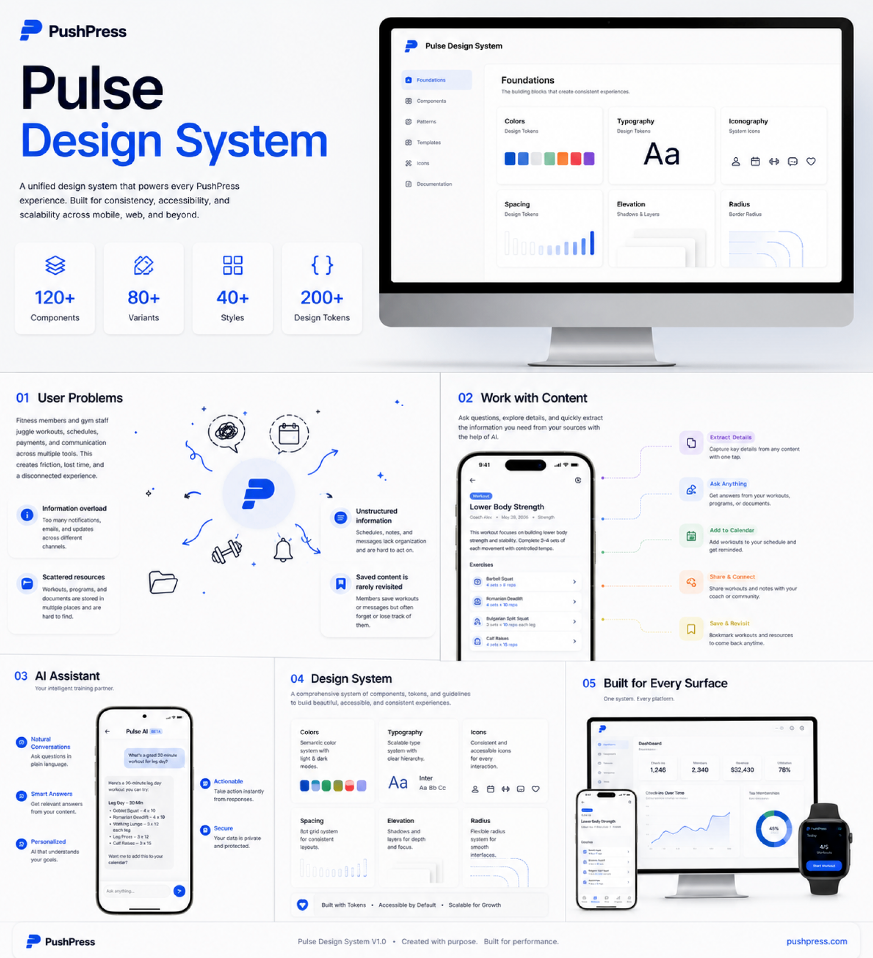
Overview — PushPress Pulse
A unified system for every PushPress experience.
Pulse is the design system powering every PushPress product — built for consistency, accessibility, and scale across mobile, web, and beyond. 120+ components, 80+ variants, 40+ styles, and 200+ design tokens work together as one language: foundations (colors, typography, iconography, spacing, elevation, radius), components, patterns, templates, icons, and documentation.
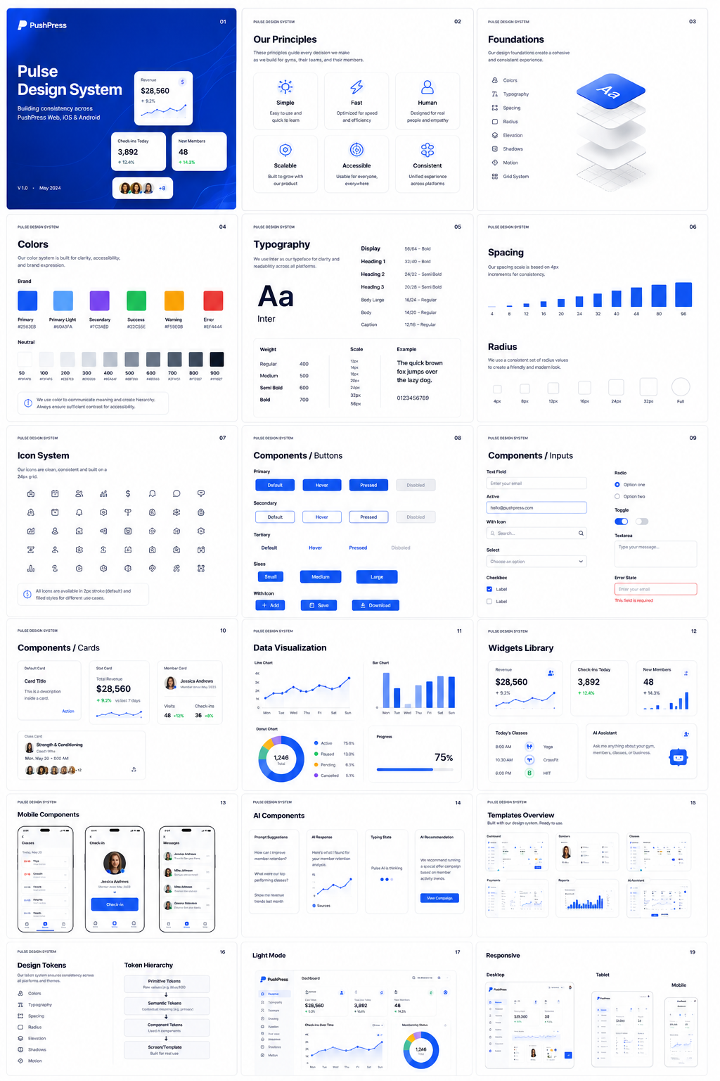
Role — Design Systems Lead
PushPress Pulse Design System
A full design system powering PushPress Web, iOS, and Android — principles, foundations (colors, typography, spacing, radius, elevation, motion, grid), a 24px icon system, components (buttons, inputs, cards, data viz, widgets), mobile and AI components, templates, tokens (primitive → semantic → component → template), light mode, and responsive rules across desktop, tablet, and mobile.
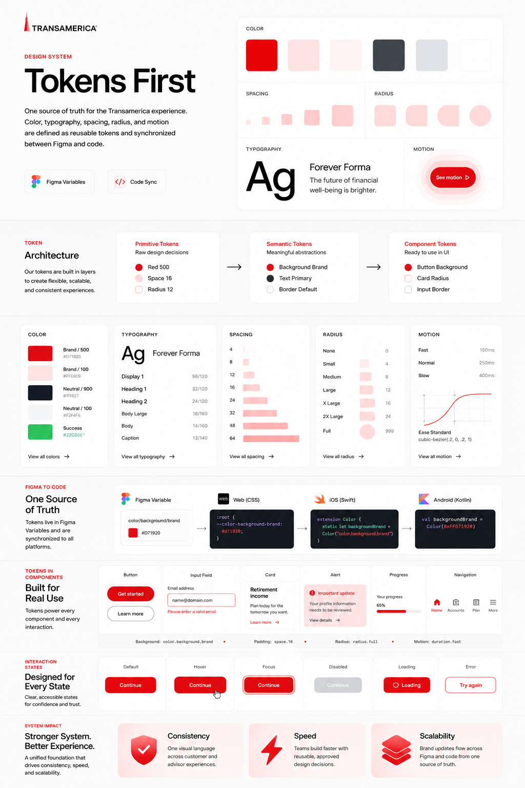
Tokens first
One source of truth for design.
Color, spacing, radius, and motion all live as tokens synced between Figma and code.
Documentation people read
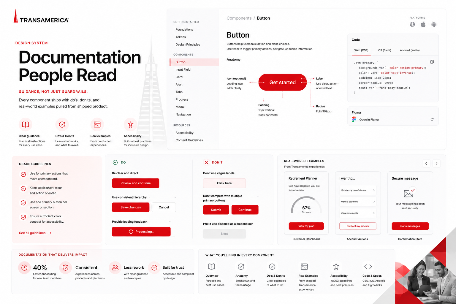
Guidance, not just guardrails.
Every component ships with do's, don'ts, and real-world examples pulled from shipped product.
"We shipped three products in the time it used to take to ship one."
— Director of Design
Do you build in code?
I pair with engineers to spec and QA every component.
Figma libraries?
Yes — with variants, modes, and auto-layout throughout.
Do you help with governance?
Contribution models, RFCs, and versioning are part of the work.
Next project
Infographics
Custom illustration systems that give products personality.